Aerotrack / SaaS Platform + AI-enabled Logistics System
The notes app that captures who you are.
Building a note-taking experience that grows with you, so you can make sense of who you were and who you're becoming.
Role
Product Designer
Duration
March – June 2025
Skills
Visual Design
User Research
Product Strategy
UX/UI
Overview
What if your notes could help you understand yourself?
A curiosity-driven passion project
For 8 weeks, I partnered with another designer and led the product concept, interaction design, and visual direction for Noto — a conceptual note-taking app.
As my capstone and farewell to four years of design school, I wanted to create something deeply personal, bringing together my favorite things: Spotify Wrapped-style self-discovery, experimental design, and pretty gradients :')
The problem
No one is building for self-insight, only self-documentation.
The notes app: a convenient but chaotic space
I've used my notes app for years, and it's become a trusty but unstructured archive of my life, from 2am thoughts, to-dos, and mind dumps. When I tried to make sense of it, I realized most journaling tools share the same flaw: they organize what you write, not what it means.
WHAT'S MISSING
Unstructured notes are hard to sort through
No tools for insights or pattern-finding
Unstructured notes are hard to sort through
No tools for insights or pattern-finding
Unstructured notes are hard to sort through
No tools for insights or pattern-finding

Years of chaotic notes. Easy to write, hard to make sense of.
Solution
Introducing Aerotrack
A reflective notes app that turns everyday writing into personal insight.
Link to PROTOTYPE
Noto creates space for free-form thought, while surfacing the themes and patterns that naturally emerge — helping you see not just what you wrote, but what it might mean.
Core flows
01 TEXT ENTRY
A simple place for your thoughts.
Plans, reflections, or brain dumps — write whatever calls to you in the moment. This space is a living archive of your life but without the clutter. Your entry will be automatically tagged with emotions and topics based on what you write.
01 TEXT ENTRY
A simple place for your thoughts.
Plans, reflections, or brain dumps — write whatever calls to you in the moment. This space is a living archive of your life but without the clutter. Your entry will be automatically tagged with emotions and topics based on what you write.
01 TEXT ENTRY
A simple place for your thoughts.
Plans, reflections, or brain dumps — write whatever calls to you in the moment. This space is a living archive of your life but without the clutter. Your entry will be automatically tagged with emotions and topics based on what you write.
01 TEXT ENTRY
A simple place for your thoughts.
Plans, reflections, or brain dumps — write whatever calls to you in the moment. This space is a living archive of your life but without the clutter. Your entry will be automatically tagged with emotions and topics based on what you write.
Research- Competitive Analysis
Understand why journaling apps fail.(목적)
Too much direction, too little you(가설)
These apps take control, limiting space for self-led reflection. Predefined selections feels mindless, overwhelming features dilute user intention, and excessive nudging feels disingenuous. (문제)
Hover to see breakdown


User Research
I surveyed 19 people to understand what was missing in their journaling.
KEY INSIGHTS
Journaling feels like a chore.
-> Too structured, too time-consuming. Digital entries get buried and forgotten.
B. Forced engagement backfires
-> Streaks, mood check-ins, daily prompts lead to half-hearted entries people never revisit.
Q: WHAT FRUSTRATES YOU ABOUT CURRENT JOURNALING OR NOTES APPS YOU'VE USED?

Messy/cluttered

Not insightful or optimized
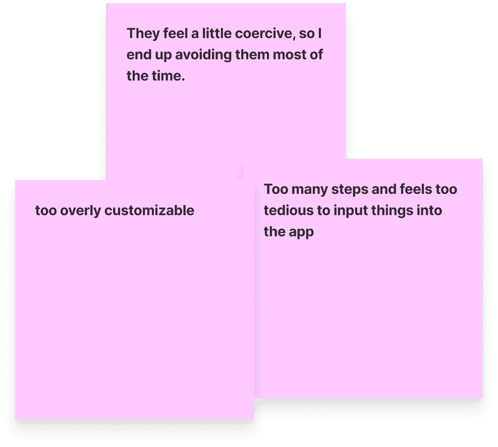
Too much
C. Stats ≠ understanding
Apps are great for tracking numbers. But they miss the why behind how you felt — not just the data point that you did.
Q: IF YOUR NOTES COULD REVEAL STUFF ABOUT YOU, WHAT WOULD YOU WANT IT TO REVEAL?

Habits and behaviors
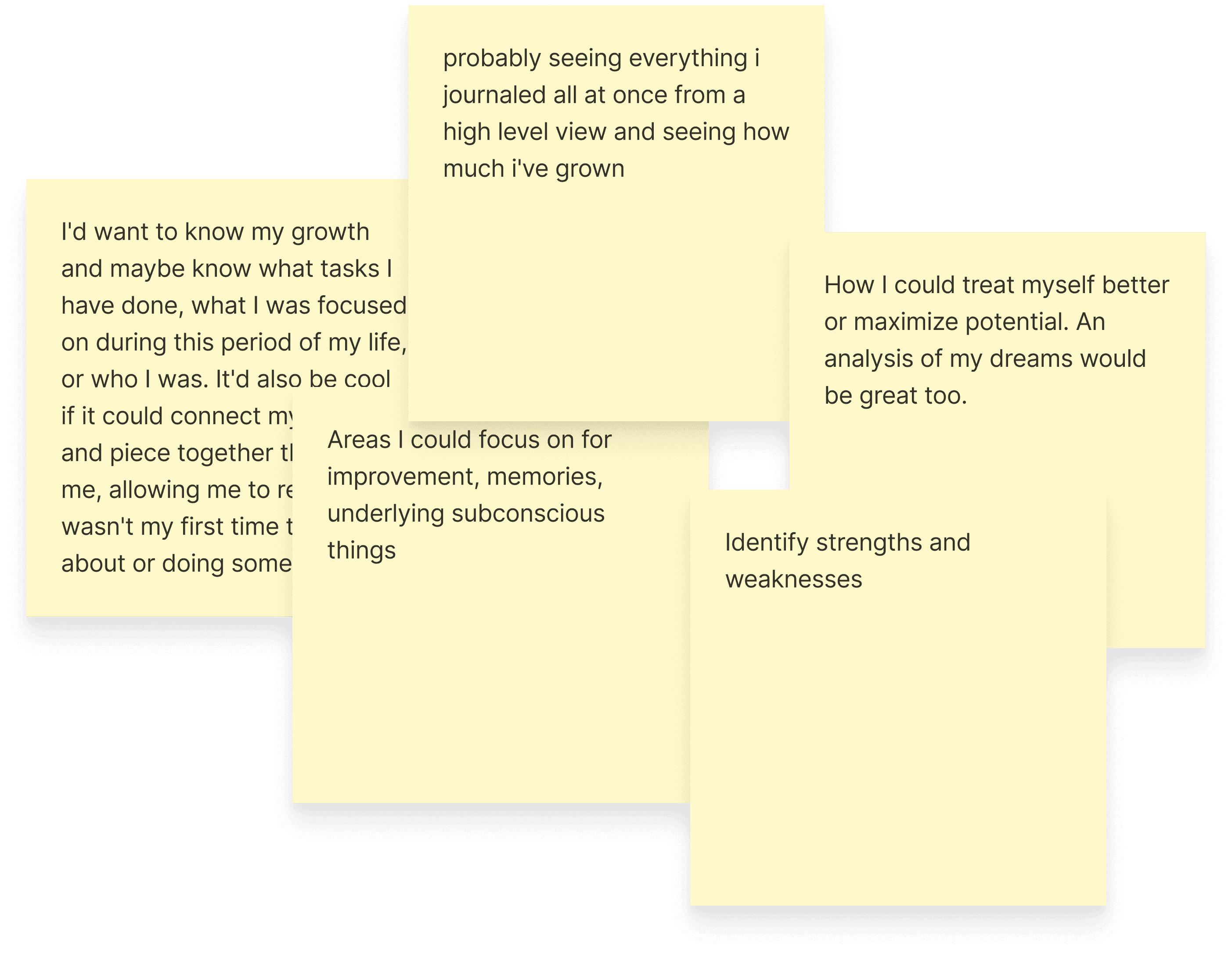
Growth

Reoccurring ideas + tasks
D. People want insights about themselves.
Apps are great for tracking numbers. But they miss the why behind how you felt — not just the data point that you did.
Q: WHEN JOURNALING, WHAT KIND OF INSIGHTS ARE YOU HOPING TO UNCOVER ABOUT YOURSELF?

Tracking

Self-awareness

Mental Health
Opportunity
People don't need more prompts, they need meaning.
Shifting from documentation to understanding
Most journaling apps approximate insight with mood sliders and surface-level stats. I wanted something more nuanced — using AI to read between the lines and pull meaning straight from the writing itself. The aim was to reveal patterns and reflections that feel genuinely tied to who the user is.
Feature matrix with direct competitors
Shifting from documentation to understanding
Most journaling apps approximate insight with mood sliders and surface-level stats. I wanted something more nuanced — using AI to read between the lines and pull meaning straight from the writing itself. The aim was to reveal patterns and reflections that feel genuinely tied to who the user is.

Feature matrix with direct competitors
Ideation
How might we turn every unfiltered writing into meaningful self-understanding?
HIGH-LEVEL GOALS
I want this app to feel natural, intuitive, and second nature.
I want this app to feel natural, intuitive, and second nature.
I want this app to feel natural, intuitive, and second nature.
I want this app to feel natural, intuitive, and second nature.
Exploring what our app should have
My teammate and I whiteboarded different ways to surface insights — from abstract, build-up visuals (dots tracking progress or patterns) to prescriptive snippets and direct feedback. This helped us realize that each idea held a different tone and that we wanted to evoke one that felt insightful but not like it boxed you in.
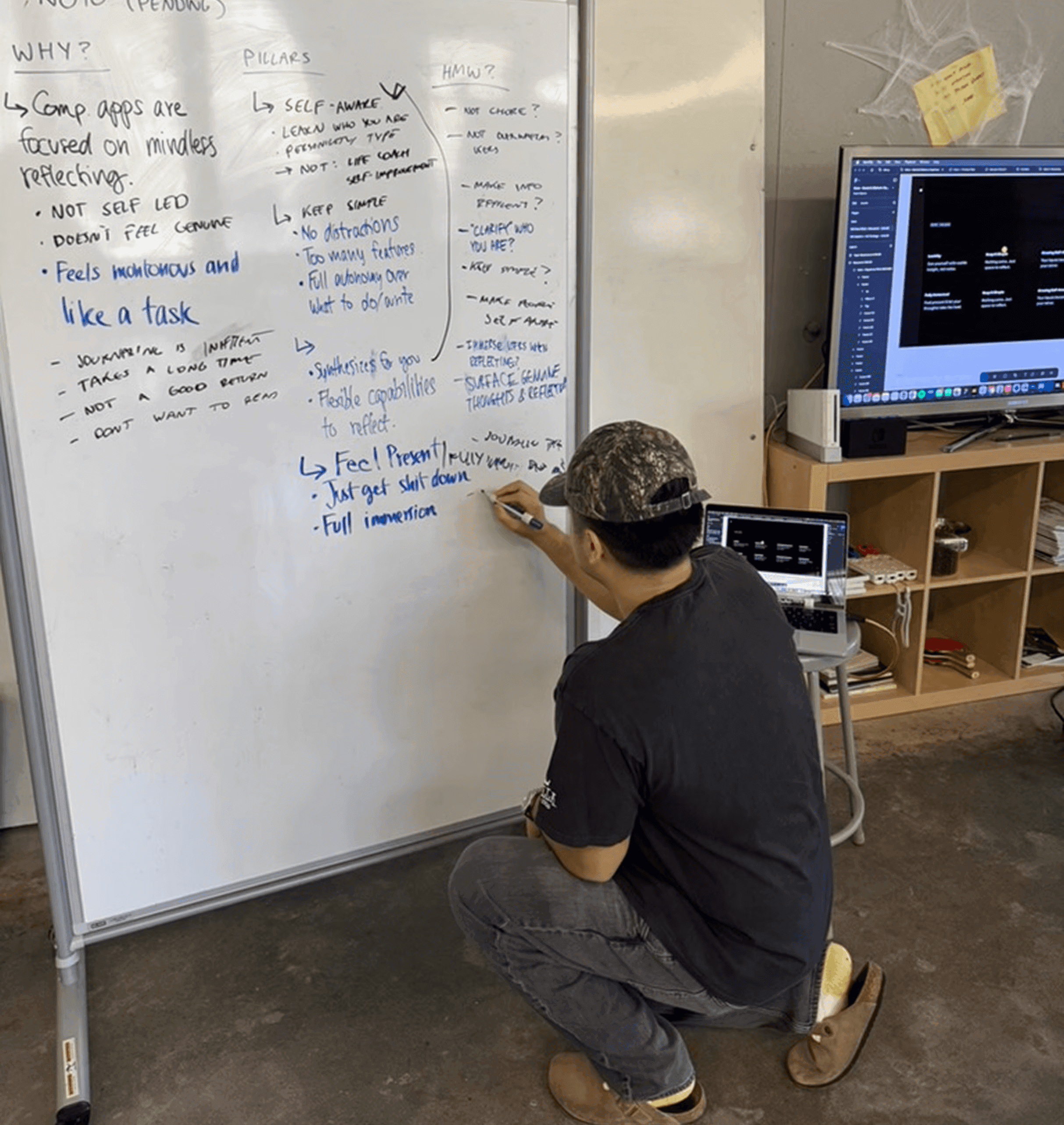
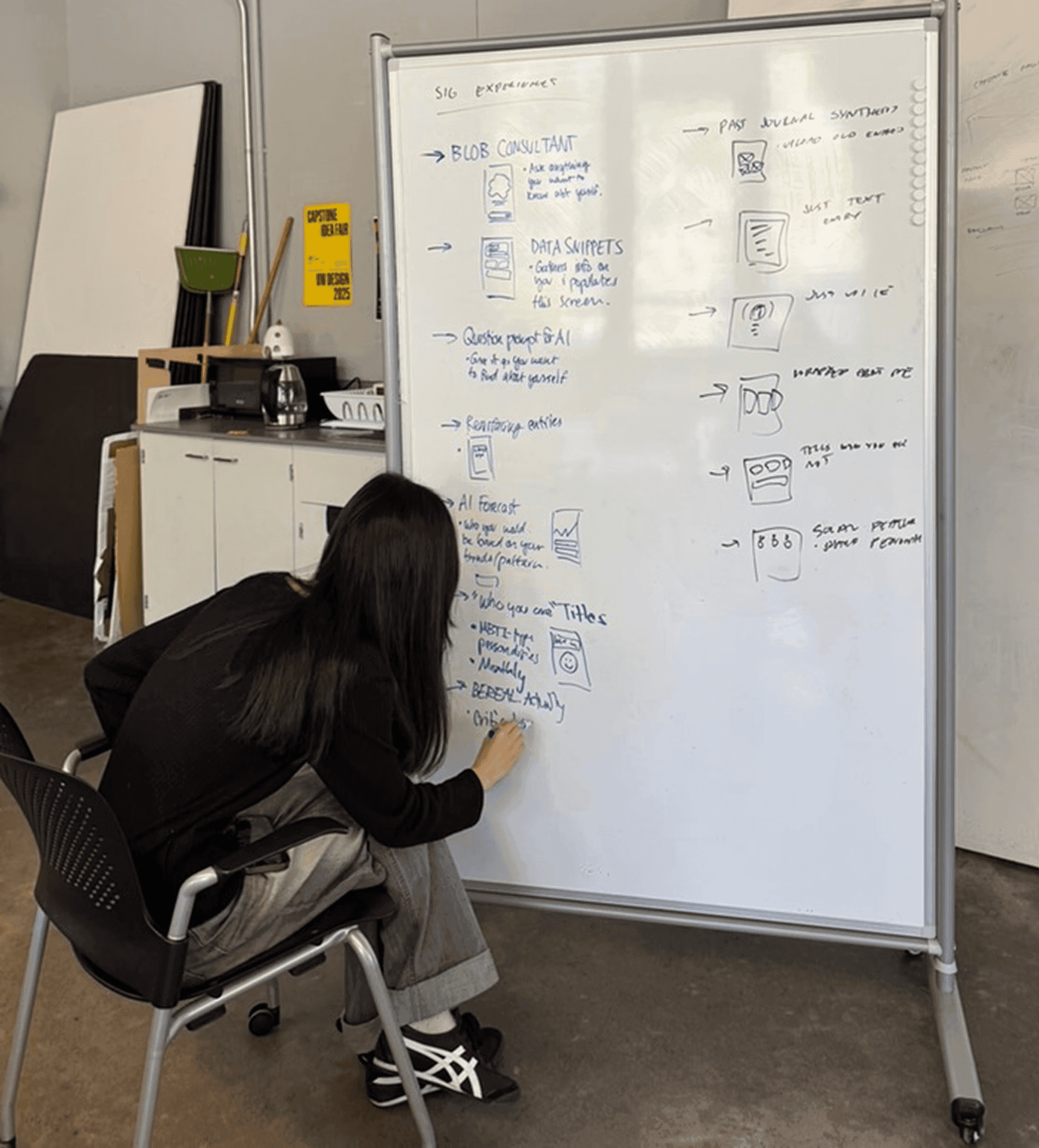
We landed on ideas that were essential to our goals.
From our research, we knew users wanted to understand not just what they were thinking, but when and why. This guided our selection of signature experiences to develop further:

Simple Entry Page

Themes Timeline
Simple Entry Page
Themes Timeline
UX Strategy
Defining the Noto experience.
An unbiased but supportive space.
Too many AI tools act like yes-men, validating rather than offering honest reflection. We made a deliberate decision not to make a personal therapist, but instead a quiet observer that surfaces patterns as they are, leaving the mental-health realm untouched. Instead, we wanted Noto to simply reflect their true selves, whatever may show up.

UX pyramid
An unbiased but supportive space.
Too many AI tools act like yes-men, validating rather than offering honest reflection. We made a deliberate decision not to make a personal therapist, but instead a quiet observer that surfaces patterns as they are, leaving the mental-health realm untouched. Instead, we wanted Noto to simply reflect their true selves, whatever may show up.
UX pyramid
Mirroring inner reflection with spatial navigation
To hide clutter and keep users fully immersed on each layer, we decided to have a spatial zoom interaction to change tabs. This way, each layer feels like a “depth of self”: from the surface-level personality to the raw inner monologue:

Mental Model

Navigation Layer
Next Steps
What I'd do next
Improve something something
Juggling three other projects limited the time I wish I had to refine the interactions and the UI. Areas like the searchability of entries + timeline events interaction still need more care. If I revisit this project I’d definitely polish the experience by thinking on a larger scale (e.g. more notes, more themes, etc.) to improve usability — or even make transformative changes to cater to a more general audience.
Looking back
What I learned from Noto.
WHAT I LEARNED
Bringing a product mindset
While this was just a school project, I approached it like a product I’d pitch. Understanding the market and defining the mission gave me a taste of designing with stakes, and how that framing sharpens clarity and impact.
Bringing a product mindset
While this was just a school project, I approached it like a product I’d pitch. Understanding the market and defining the mission gave me a taste of designing with stakes, and how that framing sharpens clarity and impact.
Bringing a product mindset
While this was just a school project, I approached it like a product I’d pitch. Understanding the market and defining the mission gave me a taste of designing with stakes, and how that framing sharpens clarity and impact.